In order to measure accuracy of potential algorithms, we need to compute the exact Cumulative Distribution Function (CDF) and Probability Mass Function (PMF) values from a brute-force analysis of the input stream. This, of course, assumes that this is even possible. For very large streams this may not be. Fortunately, our test streams are not so large.
Prior to this analysis or even to feed the data into a sketch we do need some basic information about how the data is stored so that we can correctly interpret it.
For our streamA test file we know that the data is stored as consecutive strings of numeric integers separated by a line-feeds.
We scan the file to determine the number of items, n in the file. Once this is known we create an internal array of n integers (or longs) that we will use for subsequent processing.
We scan the file again, this time extracting each string value, convert it to a primitive integer and store it into our integer array.
The array is sorted and depending on the size of the array, this could take some time.
Now that the array is sorted, the index of every item in the array is also its natural rank. The normalized rank is just the natural rank divided by n. We choose, somewhat arbitrarily, to select the percentile ranks in order to understand what kind of distribution we are dealing with. We scan the array and save the 101 quantile values corresponding to this linear series of ranks: (0, .01, .02, … .99, 1.00).
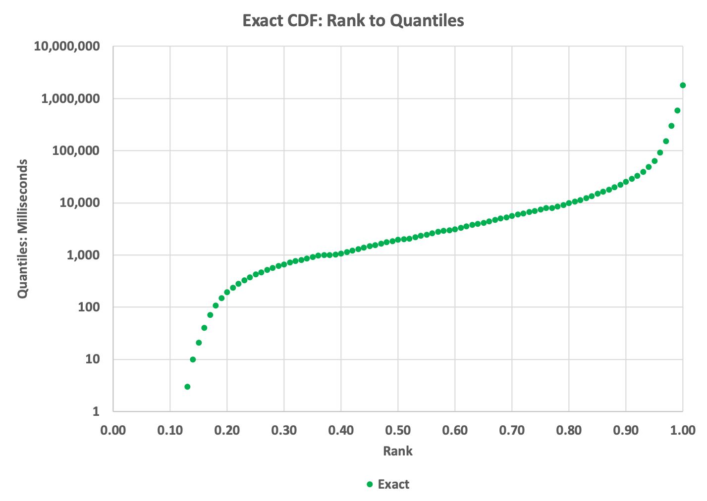
This allows us to plot the rank to quantile cumulative distribution or CDF. This is normally plotted with ranks (0 to 1.0) on the X-axis and the 101 quantile values on the Y-axis. This is a very important plot as it tells us a great deal about our data:

The reason that the left part of the curve stops at about (0.13, 3) is because slightly less than 13% of the values in the data are zeros, and we can’t plot zeros on the logarithmic Y axis; thus the apparent gap.
This is an important step and determines the quality and value of our PMF or Histogram plot. By examining the above CDF we can choose the aspects of the data that we are interested in by selecting appropriate split-point values, which are the boundaries of the bins of the PMF. This requires some judgement and could be automated, but we did not bother to do this.
For our streamA, we decided that an exponential power series with 5 equally-spaced points per order-of-magnitude should give us a reasonable-looking PMF plot. Based on the min and max values from the CDF, we generated this series mathematically.
We scan the array and save the natural ranks (indices) at the chosen split-point values. The difference between adjacent natural ranks is the mass (the number of items) between the respective splitpoints.
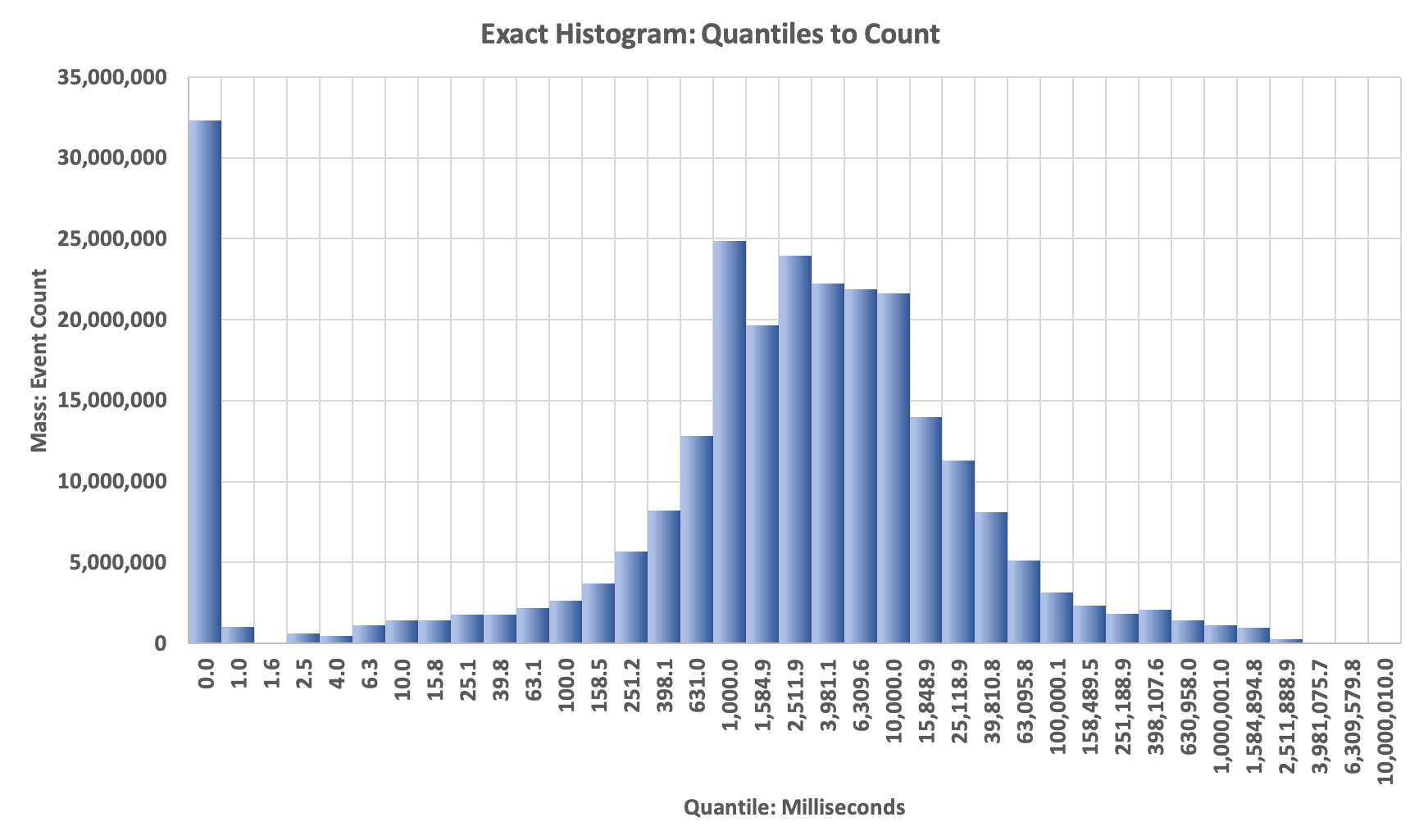
We can plot the Histogram with the split-point values on the X-axis and the differences between the respective natural ranks on the Y-axis. If we plotted the differences between the respective normalized ranks on the Y-axis we would have the PMF.

On this plot you will observe the big spike on the left. This represents the mass of all the zero values in the data. This is a bar-chart plot, so the X-axis labels are whatever we assign to them. Because all the bars are the same width, it gives the apperance that the x-Axis is a logarithmic axis … but the plotting software does not know that. Normally, one cannot plot a zero on a logarithmic axis, but here we can get away with it. :)
You can study the code that implements the above process and generated the above plots.
Run the above profilers as a java application and supply the config file as the single argument. The program will check if the data file has been unzipped, and if not it will unzip it for you.