The goal of this article is to compare the accuracy performance of the DataSketches Quantiles Sketch to an exact, brute-force computation using actual data extracted from one of our back-end servers.
Please get familiar with the Tutorial for quantiles.
The implementation of this Quantiles Sketch was originally inspired by Mergable Summaries, PODS, May, 2012 paper by Agarwal, Cormode, Huang, Phillips, Wei, and Yi.
The data file used for this evaluation, streamA.txt, is real data extracted from one of our back-end servers. It represents one hour of web-site time-spent data measured in milliseconds. The data in this file has a smooth and well-behaved value distribution with a wide dynamic range. It is a text file and consists of consecutive strings of numeric values separated by a line-feeds. Its size is about 2GB.
In order to measure the accuracy of the Approximate Histogram, we need an exact, brute-force analysis of streamA.txt.
The process for creating these comparison standards can be found here.
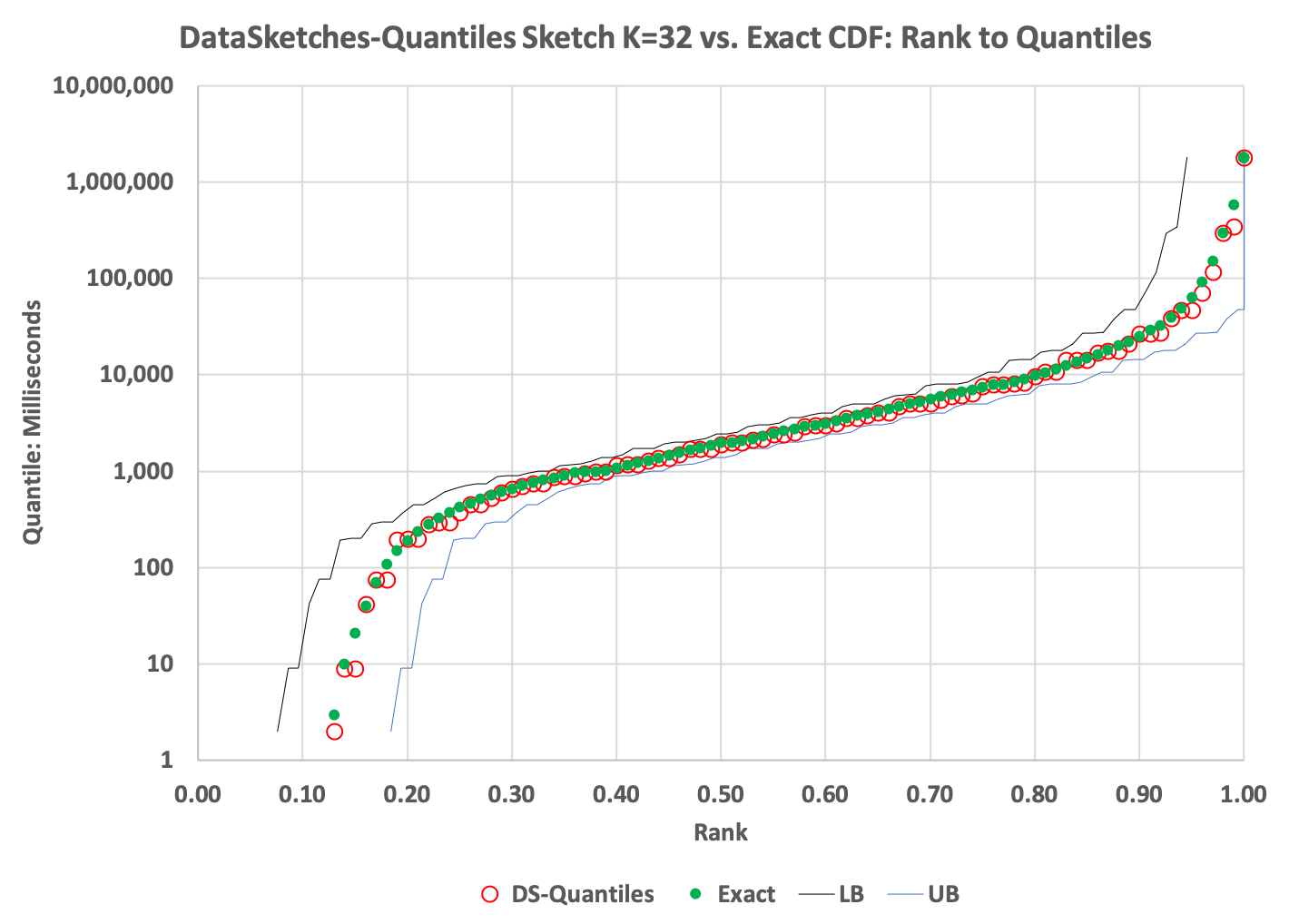
The DataSketches Quantiles Sketch provides a very straightforward tradeoff between sketch size and accuracy as the next two examples show.
The CDF plot:
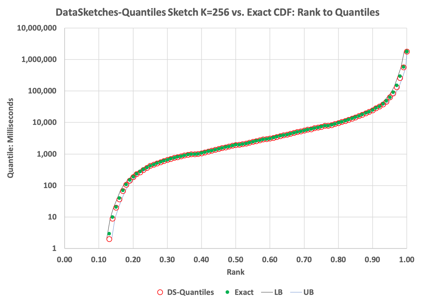
The green dots in the above plot represents the Exact cumulative distribution (CDF) of ranks to quantile values. The red circles represent the values returned from the DS Quantiles Sketch getQuantiles(double[]) function.
The plot reveals a very tight fit to the exact quantiles over the full range. The thin black and blue lines just to the left and right of the plotted points represent the lower-bound and upper-bound error derived from the sketch’s getLowerBound() and getUpperBound() functions.
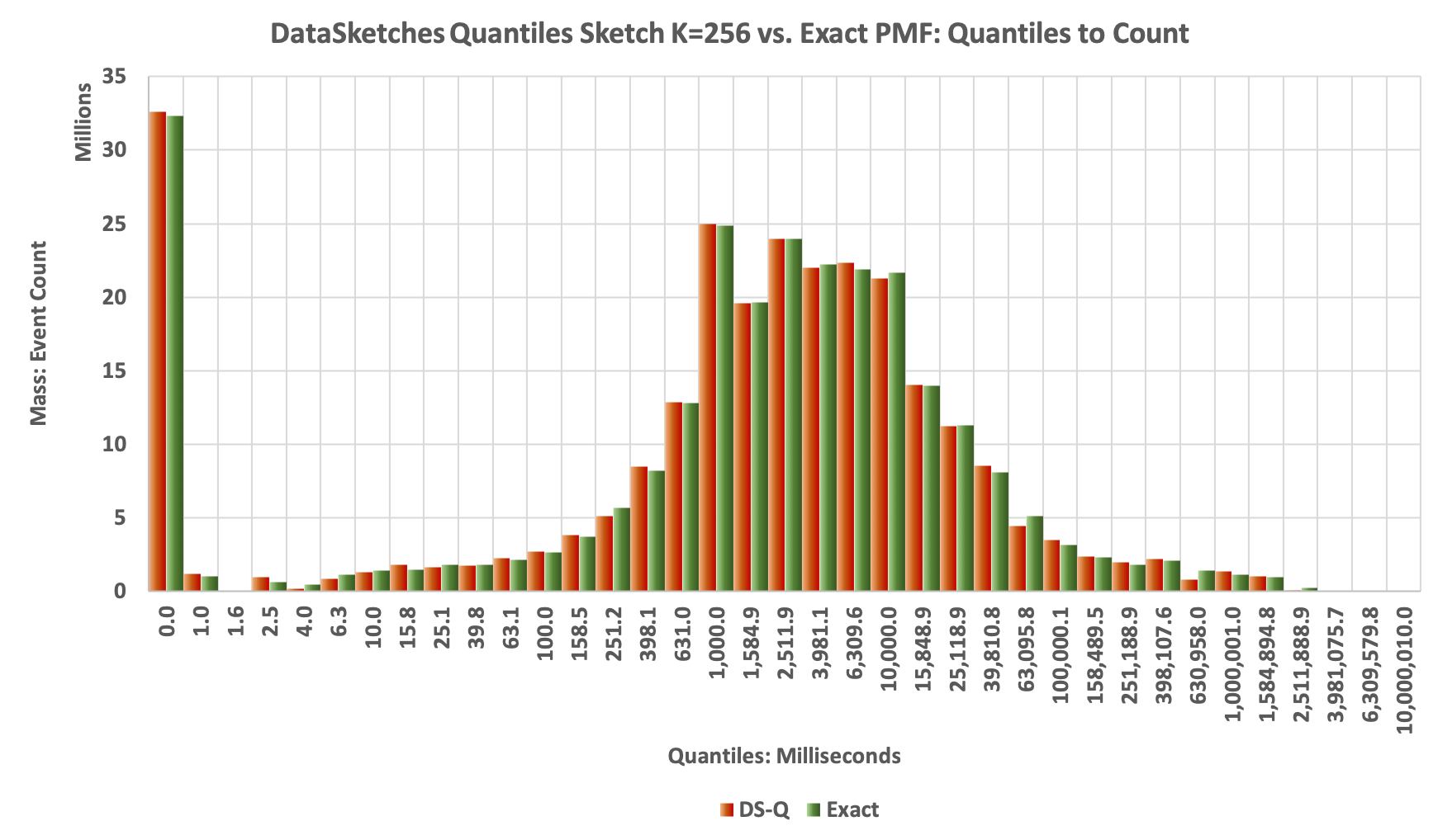
The Histogram plot:
The next plot is the Histogram generated from the values returned by the getPMF(double[]) function. Each of the returned values is multiplied by getN() to produce the respecive mass of each bin. The Green bars represent the Exact Distribution, and the Orange bars represent the results obtained from the DS Quantiles sketch. You can see that they match pretty well.
The CDF plot:
Note the wider interval between the upper and lower bounds curves:
The Histogram plot:
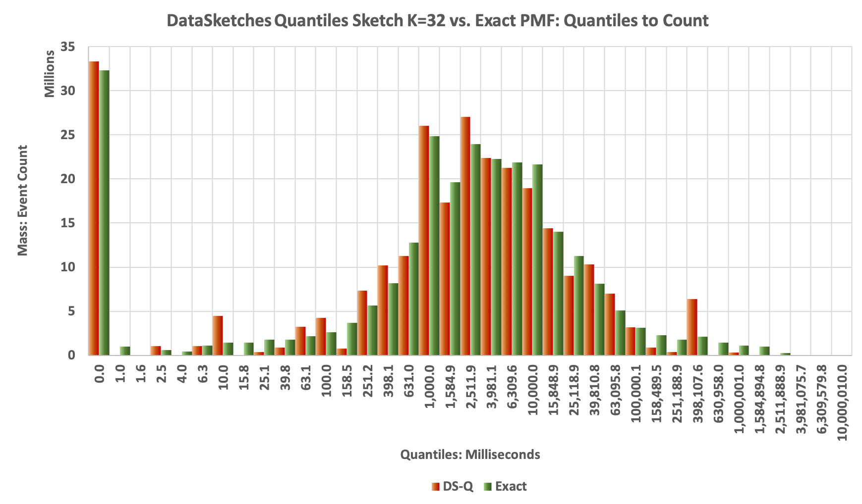
A little noiser but still tracks the exact shape pretty well:
The following are used to create the plots above.
Run the above profilers as a java application and supply the config file as the single argument. The program will check if the data file has been unzipped, and if not it will unzip it for you.

