The goal of this article is to compare the accuracy performance of the Druid built-in Approximate Histogram to an exact, brute-force computation using actual data extracted from one of our back-end servers.
Please get familiar with the Tutorial for quantiles.
Compare this study with the DataSketches Quantiles StreamA Study with the same input data.
The implementation of this Approximate Histogram was based on the February, 2010 paper by Yael Ben-Haim and Elad Tom-Tov of the IBM Haifa Research Lab. However, it should be noted that the authors of the paper specifially mention two caveats:
Unfortunately, a lot of the data that we tend to analyze is highly skewed so these caveats don’t bode well for this study. Nonetheless, we thought it would be useful to test it anyway.
The data file used for this evaluation, streamA.txt, is real data extracted from one of our back-end servers. It represents one hour of web-site time-spent data measured in milliseconds. The data in this file has a smooth and well-behaved value distribution with a wide dynamic range. It is a text file and consists of consecutive strings of numeric values separated by a line-feeds. Its size is about 2GB.
In order to measure the accuracy of the Approximate Histogram, we need an exact, brute-force analysis of streamA.txt.
The process for creating these comparison standards can be found here.
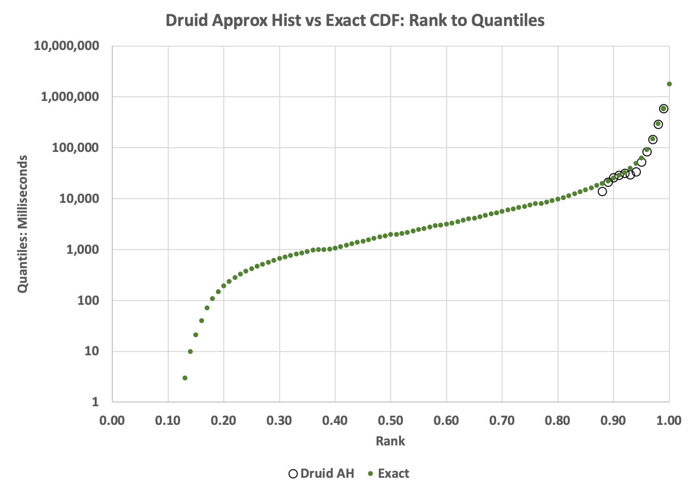
The green dots in the above plot represents the Exact cumulative distribution (CDF) of ranks to quantile values. The black circles in the upper right corner of the plot represent the values returned from the Approximate Histogram getQuantiles(float[]) function.
The plot reveals a dramatic failure of the Approximate Histogram. Below rank = 0.89, the returned array had all zeros.
The next plot is the Histogram generated from the values returned by the Histogram class generated by the toHistogram(float[]) function.

Compared to the true histogram (green bars) the histogram produced by the AH algorithm is highly distorted. Note that the green spike at the low end is caused by zeros in the raw data, which is a common occurrence in a lot of data we collect. To make the distortion easier to visualize the same data are plotted using lines instead of bars as in the following:
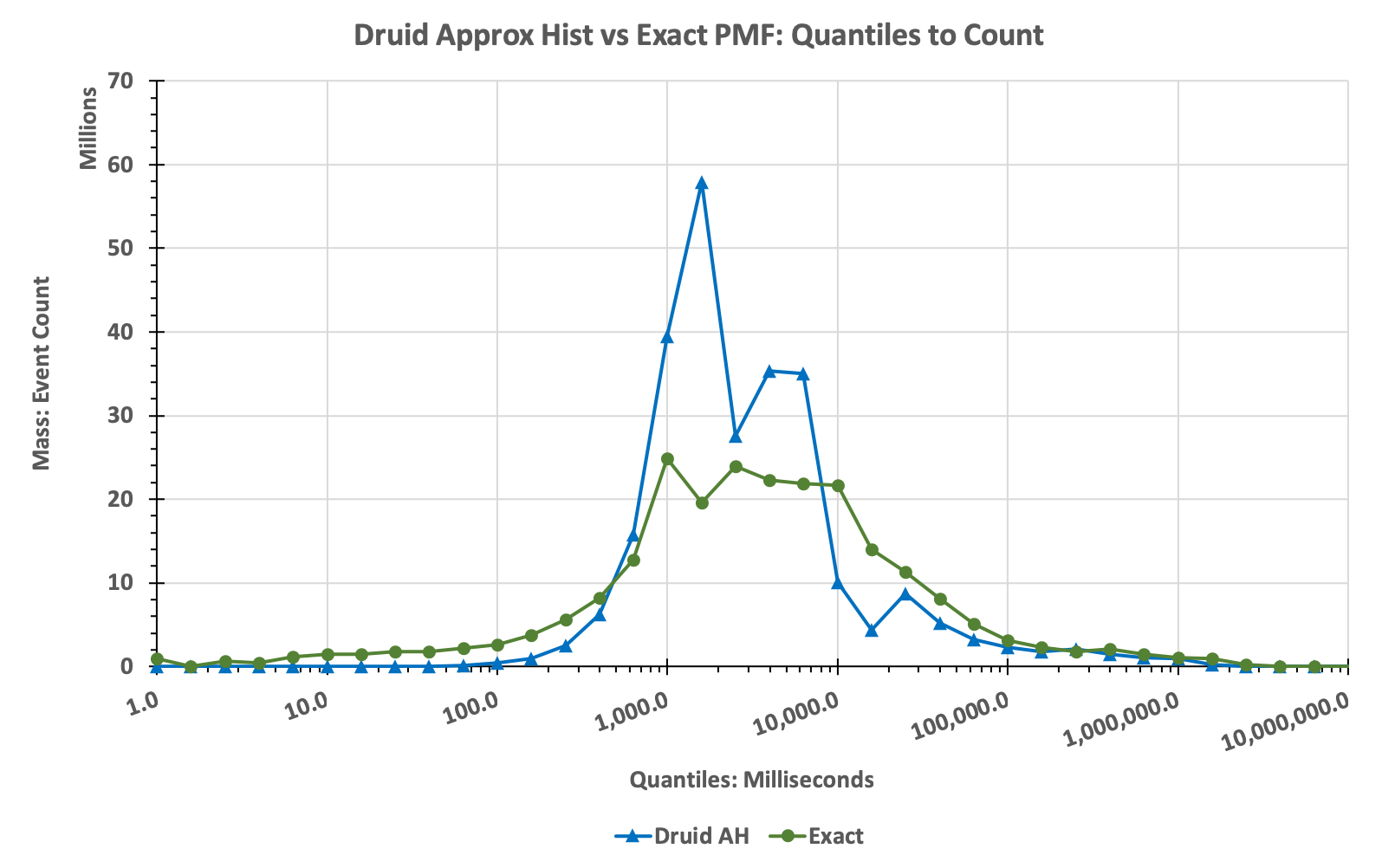
Note that the Approximate Histogram tool gives the user no warning that these serious distortions might be occurring, it just fails silently.
Users would be well-advised to not use this tool for serious analysis.
The following are used to create the plots above.
Run the above profilers as a java application and supply the config file as the single argument. The program will check if the data file has been unzipped, and if not it will unzip it for you.

